Image
The Image component is a flexible, responsive image component. It supports aspect ratios, border-radius, variants, and SVG images. The component also includes lazy loading and can be used as a child component.
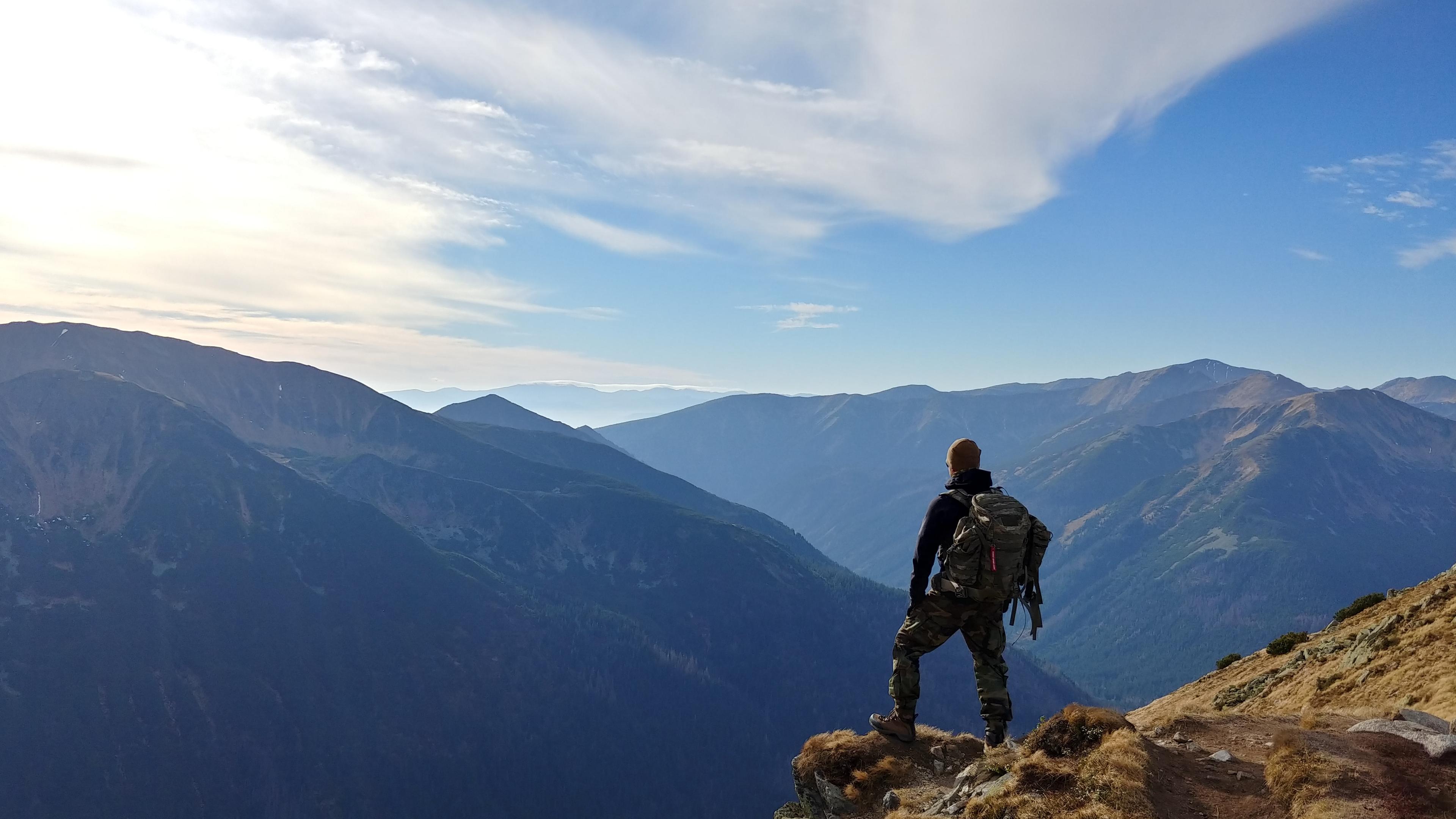
Import
_10import { Image } from '@ef-global/backpack/Image';
Props
| Name | Type | Description |
| src | string | The image source URL. |
| aspectRatios | object | An object containing the aspect ratios for different breakpoints. |
| asChild | boolean | A boolean to indicate whether the image should be rendered as a child component. Defaults to false. |
| radius | string | The border-radius value. |
| variant | string | The box variant value. |
| inverse | boolean | A boolean to indicate whether the image should be displayed in inverse mode. Defaults to false. |
| className | string | Additional CSS classes. |
| alt | string | The image alt text. |
| style | CSSProperties | Inline styles for the image. |
| loaded | boolean | A boolean to indicate whether the image has been loaded. Defaults to false. |
Examples
Default Example
_11const DefaultExample = () => {_11 return (_11 <Image_11 aspectRatios={{ s: '16/9', l: '1/1' }}_11 radius='m'_11 alt='Image alternate'_11 src='https://a.storyblok.com/f/171771/4656x3492/bbf48d4721/wojciech-then-dija5f0vogq-unsplash.jpg'_11 data-slot='Image'_11 />_11 );_11};
AsSvg Example

_11const AsSvg = () => {_11 return (_11 <Image_11 aspectRatios={{ s: '1/1' }}_11 radius='none'_11 alt='Image alternate'_11 src='https://placeholder.pics/svg/300.svg'_11 data-slot='Image'_11 />_11 );_11};